Lending · New customer
Personal Loan
Designing a personal loan journey for new customers

Context
At Backbase, I worked on the Personal Loans experience for new customers, covering the journey from initial estimation through pre-qualification to receiving a personalised loan offer. Unlike existing customers, new users had no pre-filled financial data, which required a more guided experience to collect information while maintaining clarity, trust and usability across multiple steps.
Problem
The existing experience presented several usability and structural challenges. Financial inputs were difficult to interact with precisely, particularly when using controls such as sliders, which often led to inaccurate selections and frustration on mobile. At the same time, key financial information such as repayment breakdowns and total costs was not always presented in a way that was easy to understand.
In addition, interaction patterns and layouts lacked consistency and were not designed with scalability in mind, particularly for future mobile use. All of this needed to be addressed while still respecting business rules, legal requirements and design system constraints.
Goal
The goal was to make the experience easier to use and easier to understand. That meant reducing the mental effort across the flow by:
Creating patterns that would scale across devices
Letting users input values precisely
Making financial outcomes clear
Approach
I focused on three things: structuring the flow, fixing interaction patterns and improving how data was presented.
I broke the journey into clear steps so users always knew where they were. I then challenged existing interaction patterns, replacing imprecise or ambiguous inputs with more structured and accessible alternatives. I also reorganised how financial information was shown, making sure the most important data stood out while still keeping everything transparent.
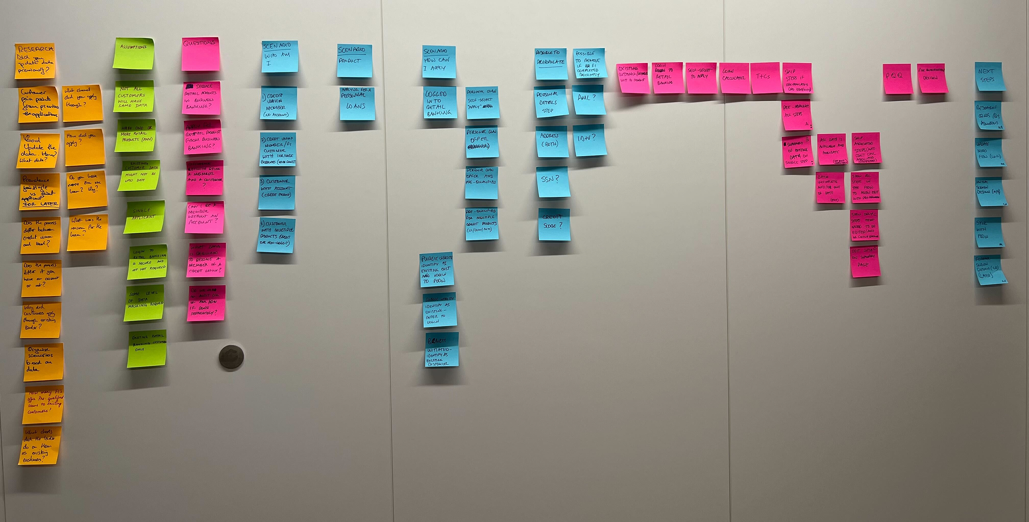
This approach required close collaboration with product managers, engineers and the design system team. I iterated through multiple rounds of feedback, both within my immediate team and across the wider design organisation.
Solution
I focused on three key parts of the journey: the loan estimator, pre-qualification and the loan offer.
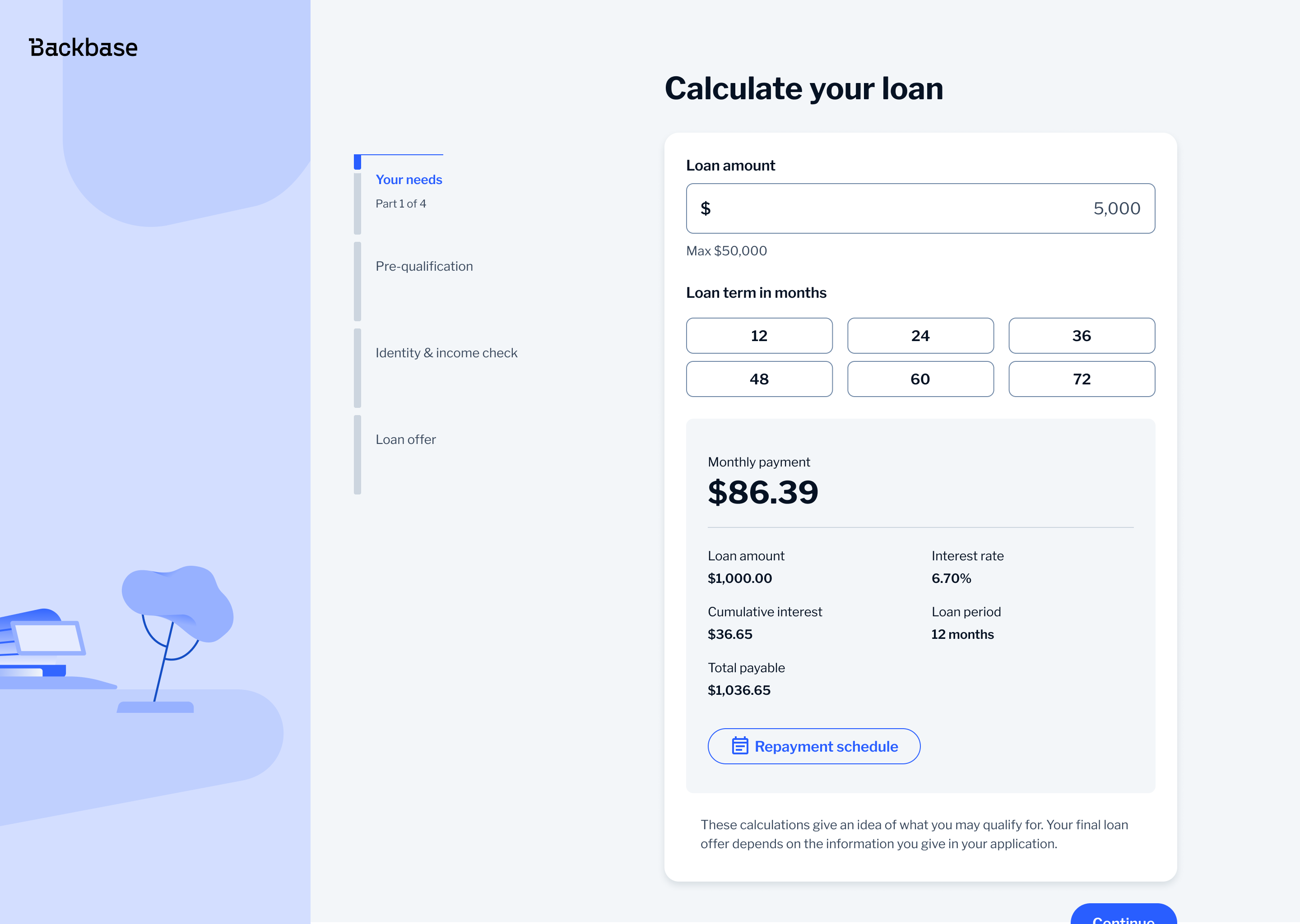
Loan Estimator
The loan estimator relied on sliders, which made it hard to select exact values and caused issues on mobile.
I replaced sliders with button-based selection. This made it easier to choose precise values, reduced input errors and worked better across both desktop and mobile. It also improved accessibility, especially for users relying on assistive technologies.
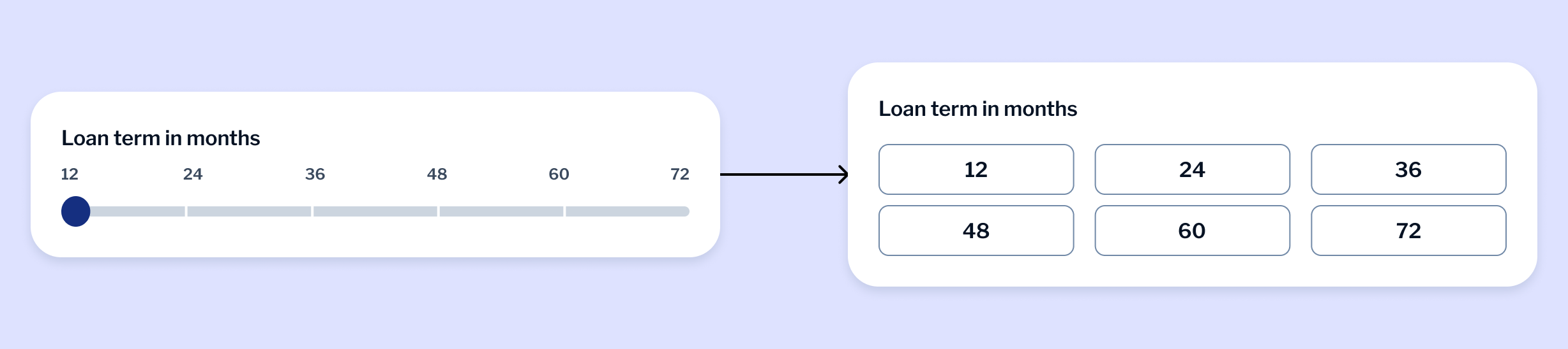
This wasn't part of the design system, so I proposed it as a new pattern. I took it through several rounds of feedback with designers and product stakeholders before presenting it to the design system team. It was well received and recognised as a strong example of how to introduce a new component.
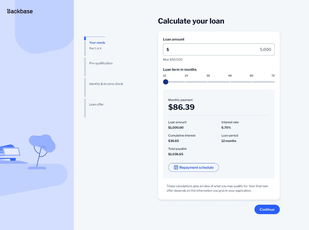
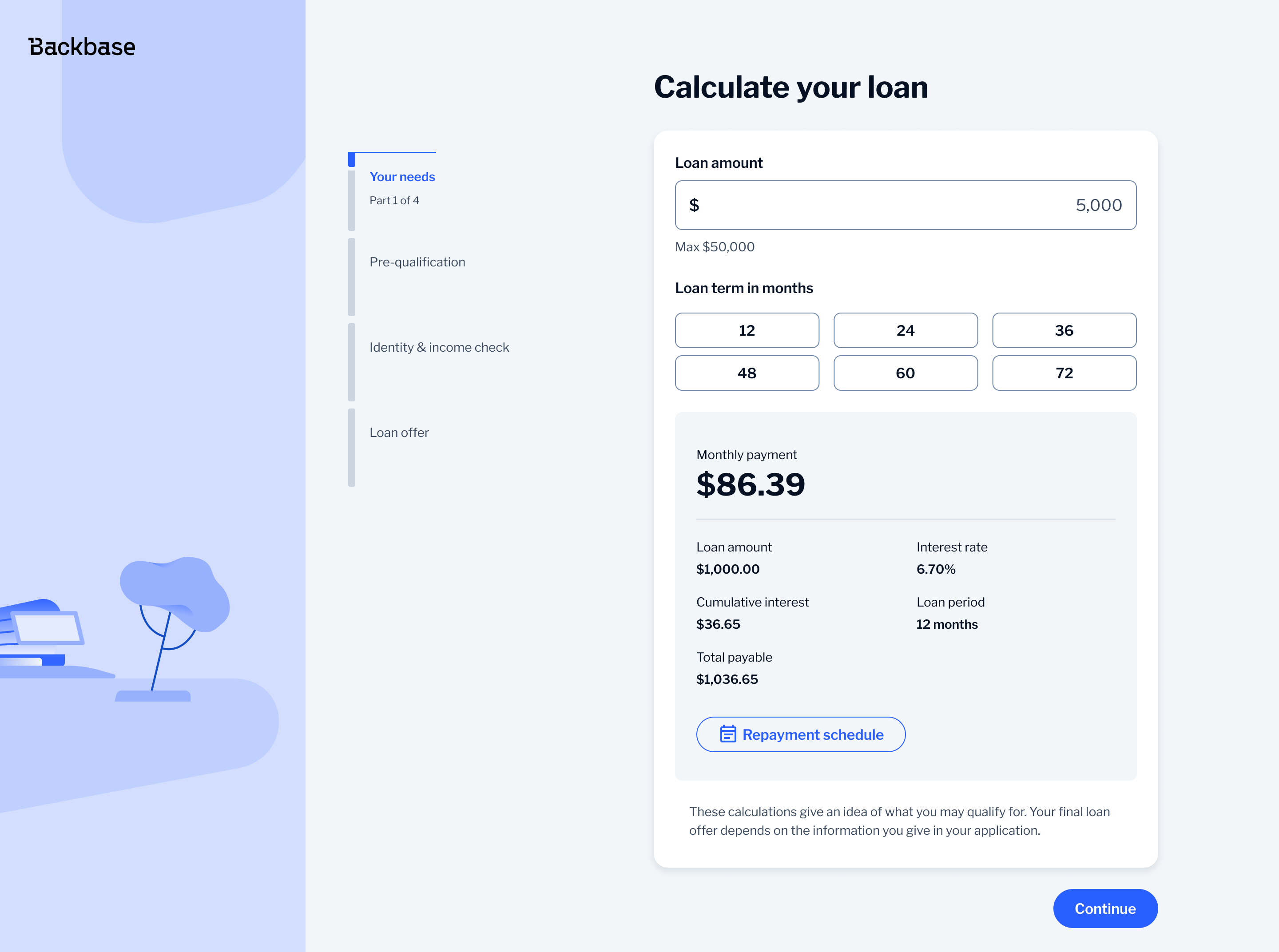
I also reworked how financial data was displayed. Instead of using a two-column layout with labels and values, I grouped them vertically and used the full width of the component. This made the content easier to scan and naturally adaptable to smaller screens.
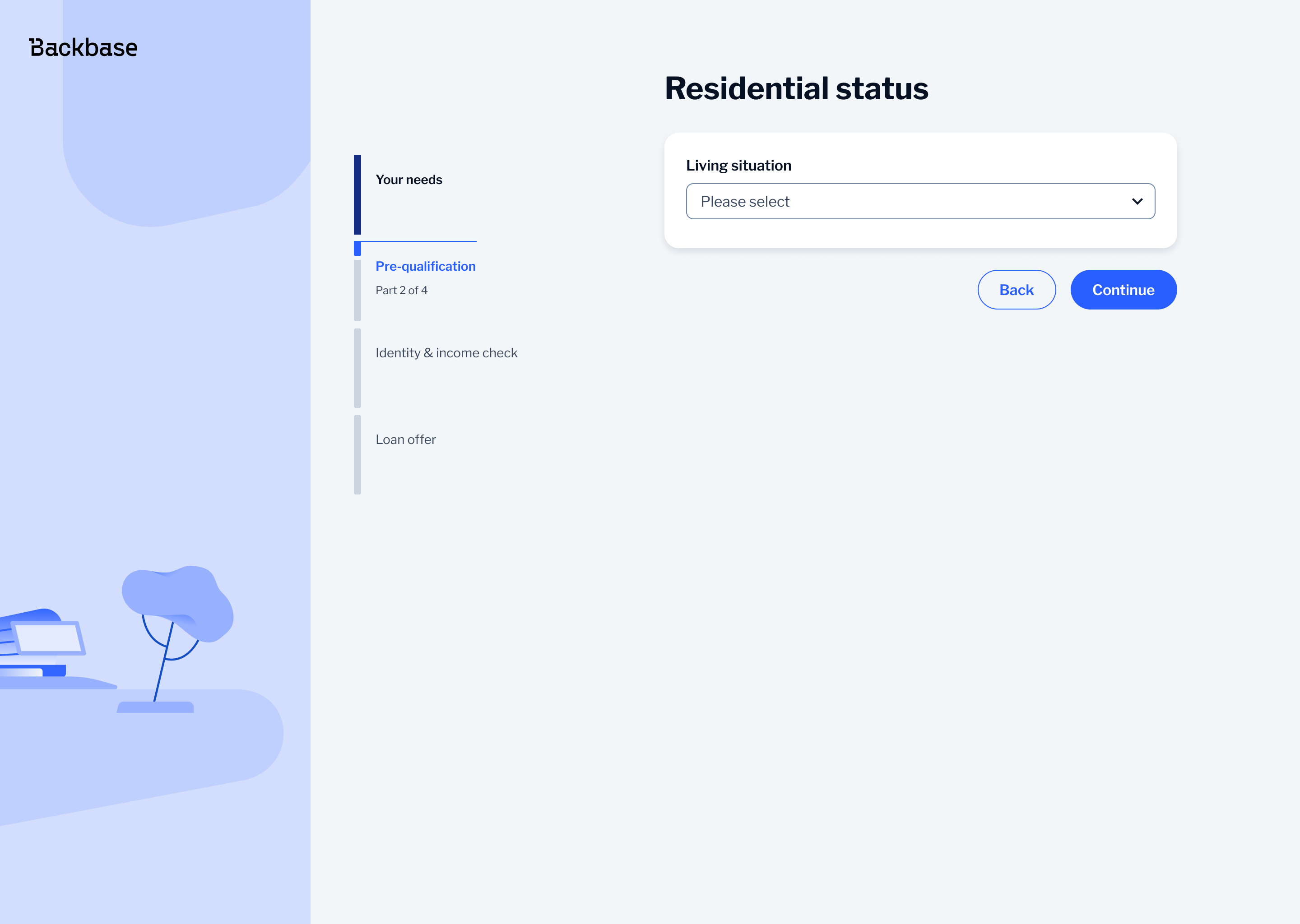
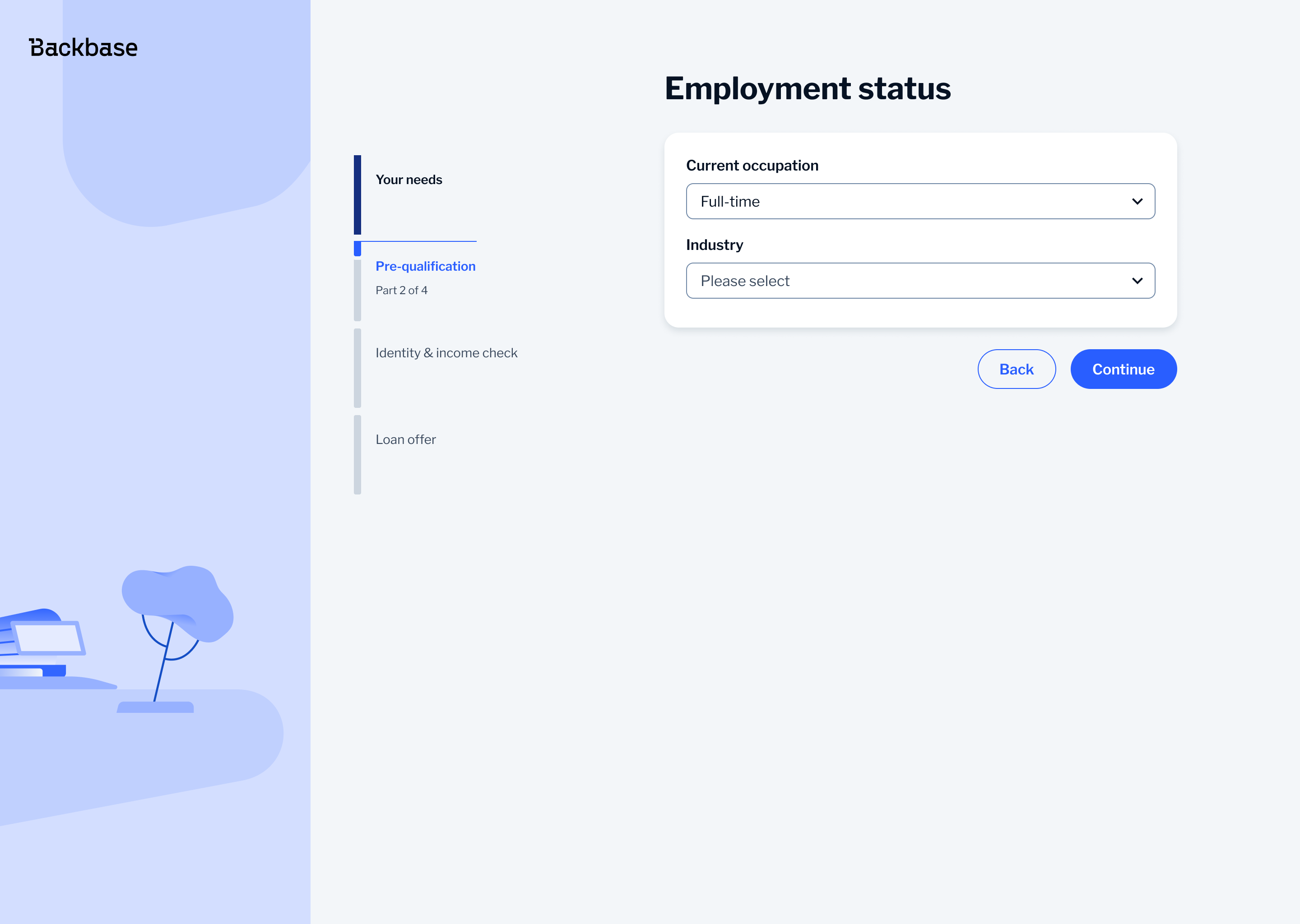
Pre-qualification Questionnaire
The pre-qualification questionnaire is one of the most sensitive steps in the journey as users are asked to share personal financial information. If this step feels unclear or difficult, users are more likely to lose trust or drop off.
I broke the flow into clear steps, such as residential status, employment and income so the users only deal with one thing at a time making the process easier to follow and less overwhelming.
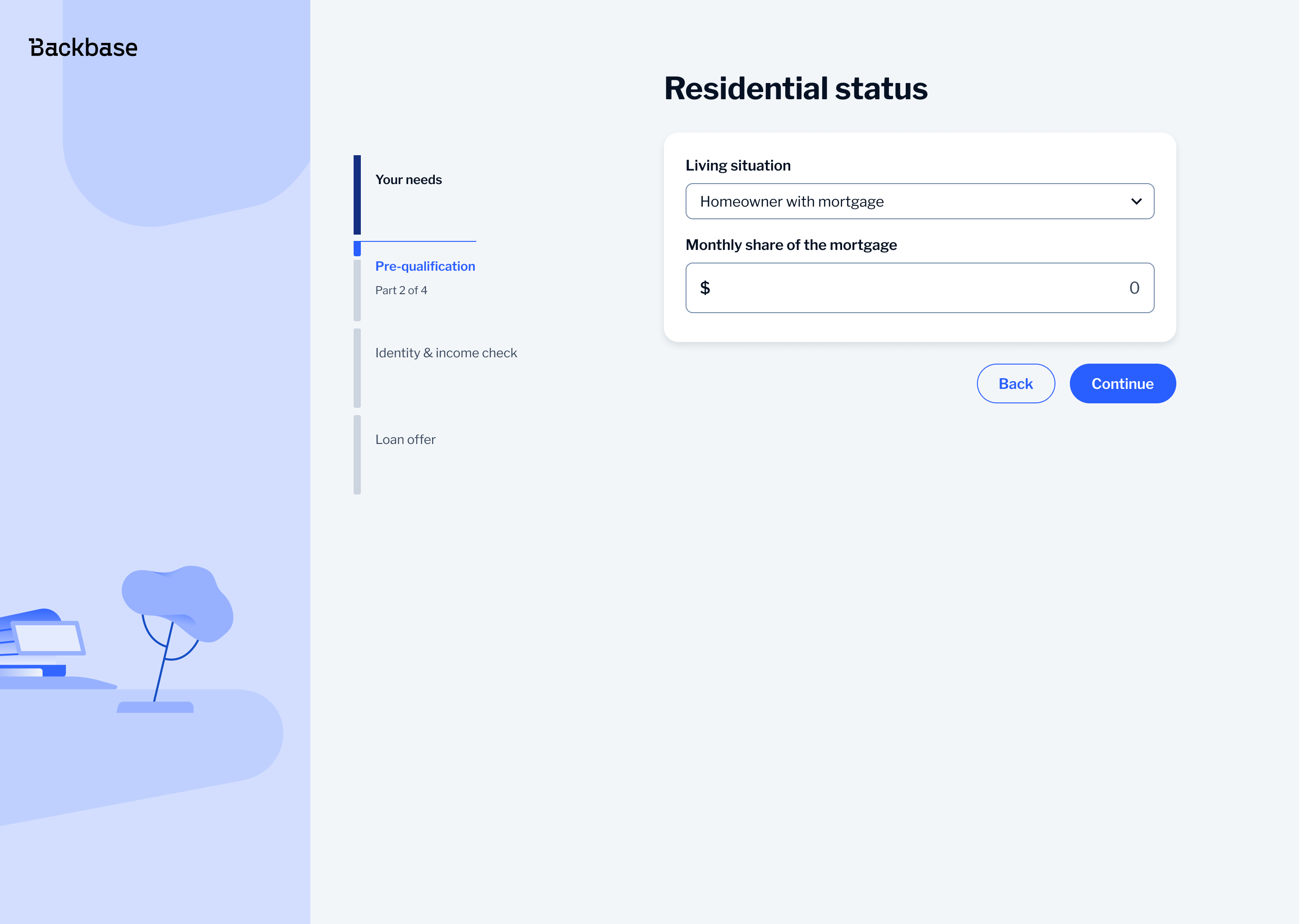

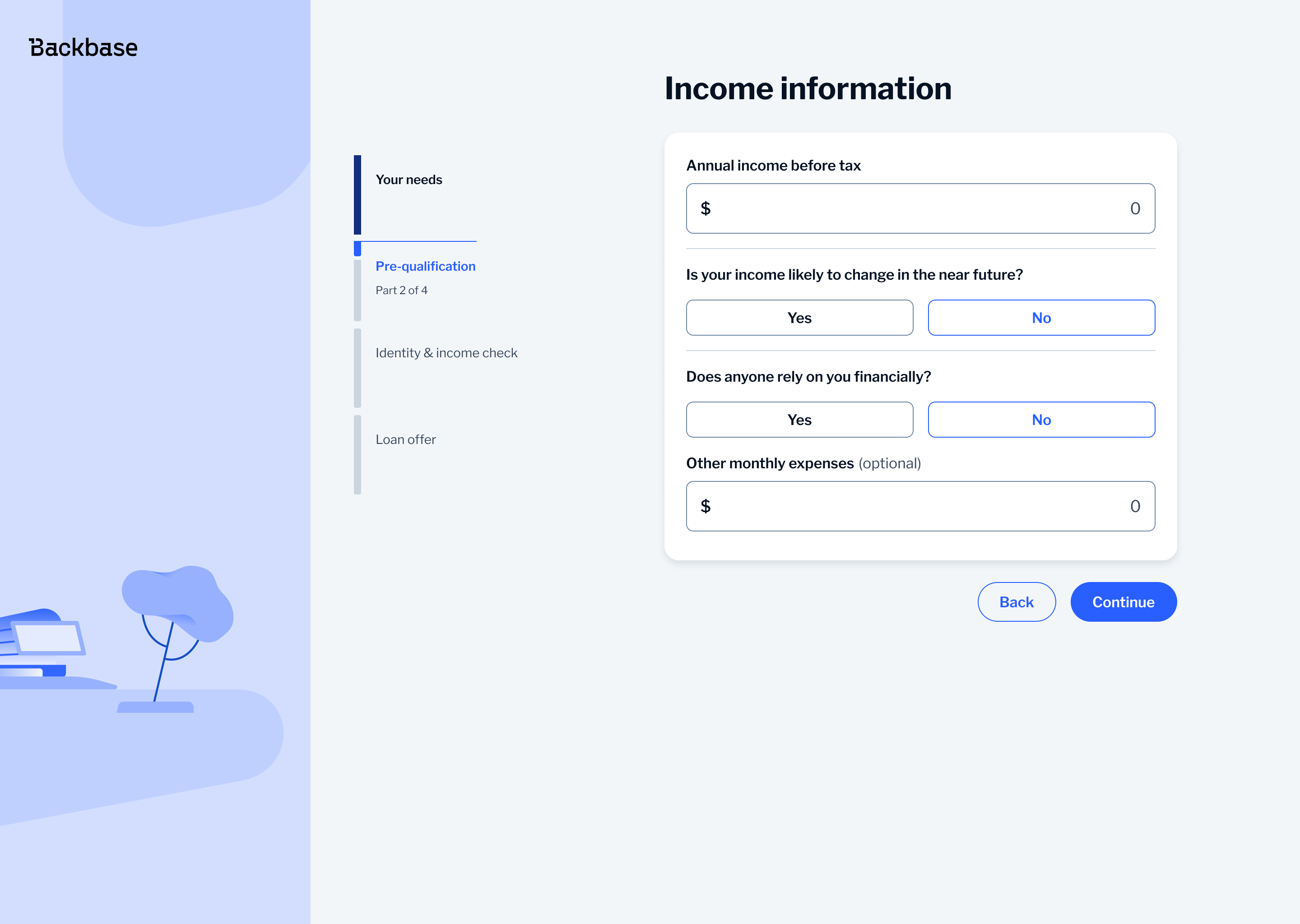
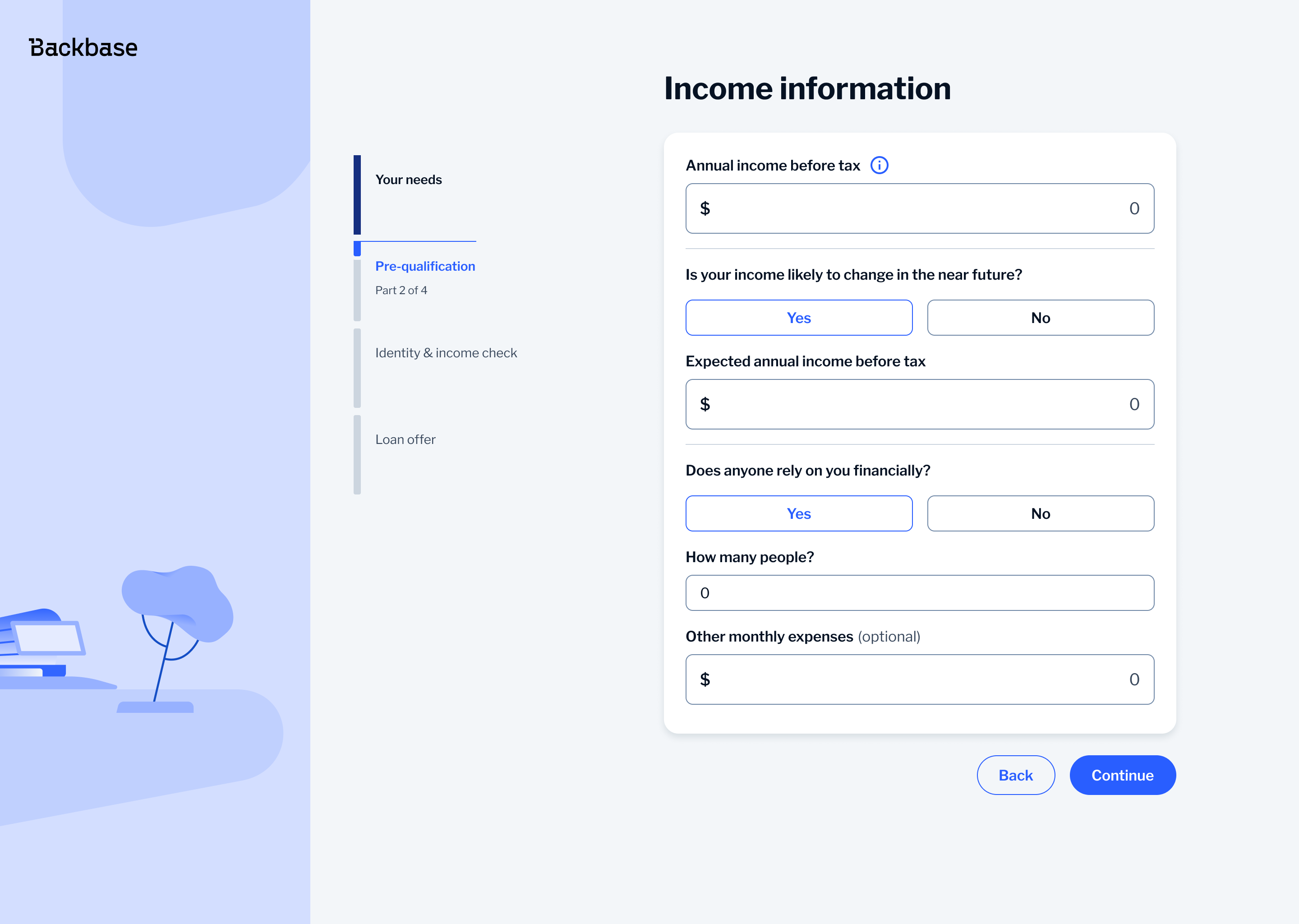
A key change was replacing toggles normally used in Backbase for yes/no questions with a button select component. Toggles are typically used for settings where users turn something on or off. In this flow, they felt out of place, weren't conversational and could become confusing if more than two choices are needed.
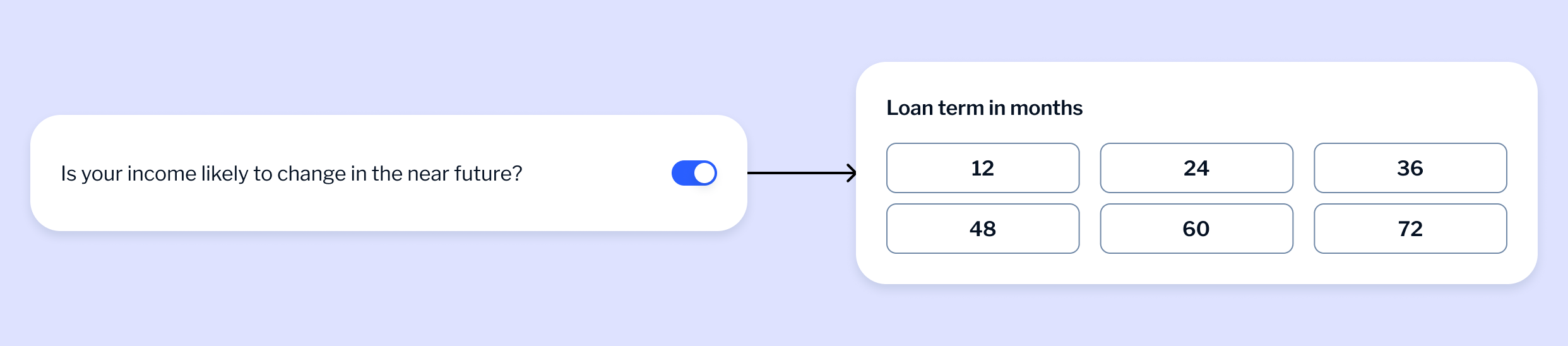
With button select, all options are visible from the start making it easier for users to understand and choose the right one. It also works better on mobile as the buttons are easier to tap and less prone to mistakes.
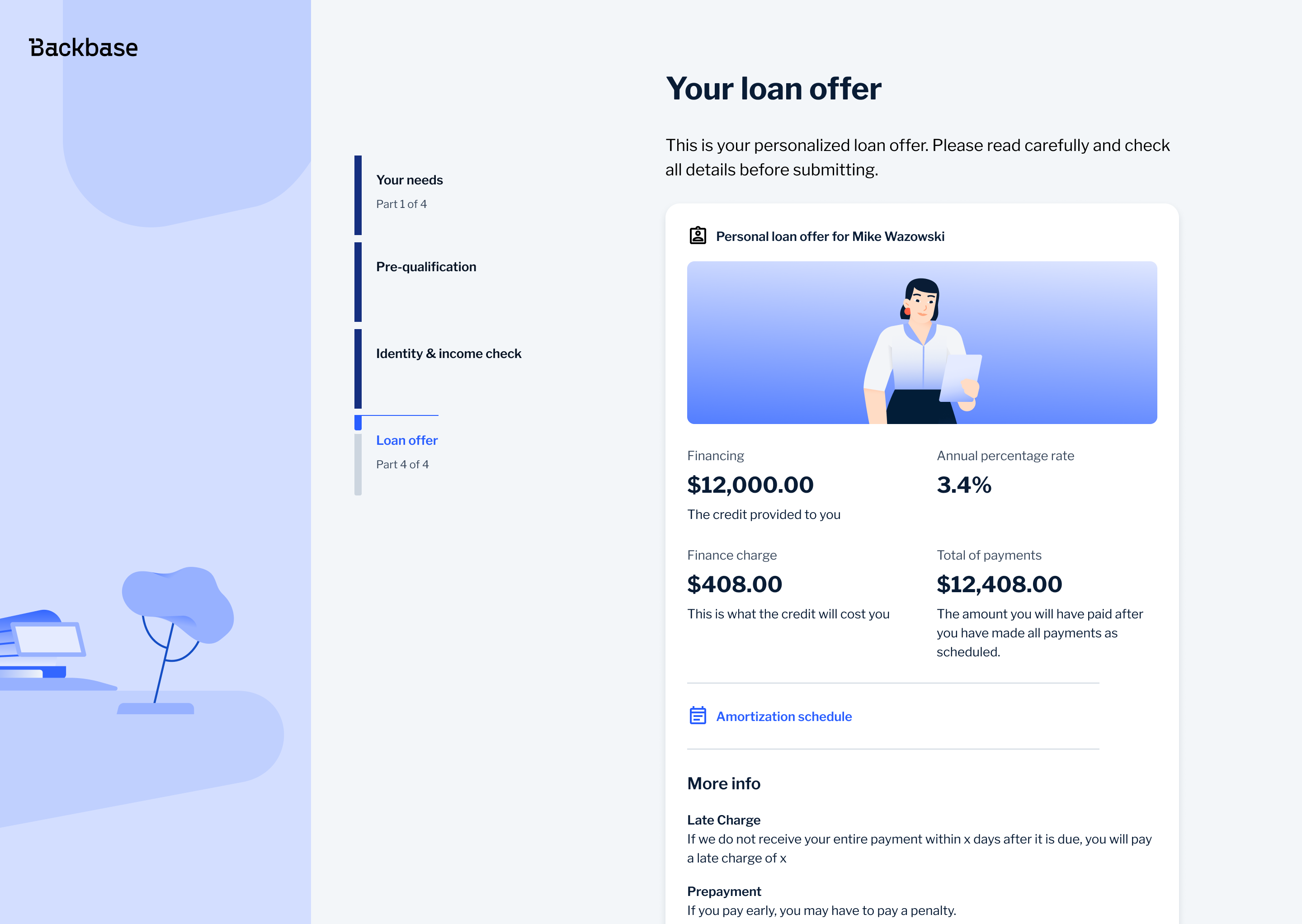
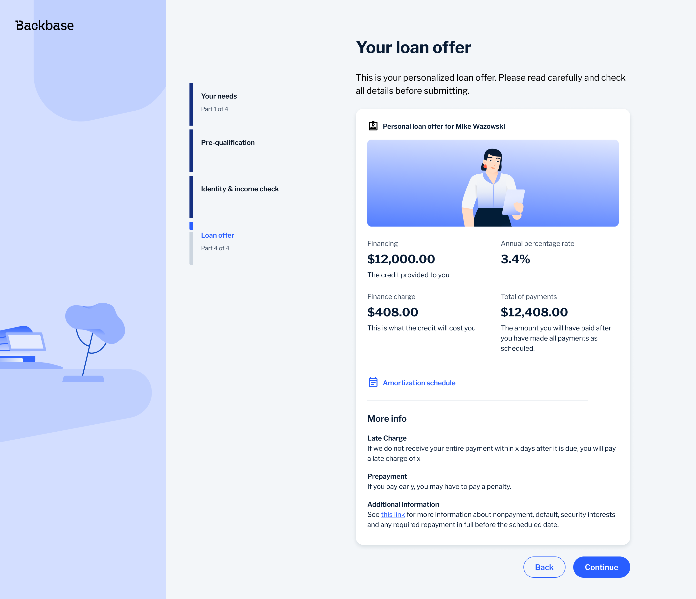
Loan Offer
The loan offer is the point where users decide whether to accept, so the priority was making the key information easy to understand at a glance. I structured the layout to clearly separate what the user receives from what the loan costs, prioritising the loan amount and APR, while keeping supporting details like finance charge and total repayment visible but secondary.
To avoid overwhelming users, I broke the information into clear, scannable sections instead of dense blocks, making it easier to compare key numbers quickly. More complex details, such as the amortization schedule, were moved behind secondary actions, while legal content was placed lower in the hierarchy. This kept the main decision simple while still providing full transparency when needed.
Outcome
The redesigned experience made the journey easier to use and easier to understand. Users could input values more precisely, understand financial outcomes more quickly and move through the flow with less friction.
The work also introduced more consistent and scalable interaction patterns and contributed to the design system by validating a reusable selection component.
Bonus
To support UX writing across the journey I created a custom AI assistant using Gemini. I trained it using internal copywriting guidelines created by our UX writing lead and defined a clear persona for the agent so it could follow the tone, structure and language patterns used across the product.
I used this as a support tool when working on labels, error messages, headers and outcome screens, where consistency in language is especially important. Instead of generating copy blindly, I used it to validate wording, explore alternatives and ensure alignment with existing standards.
This helped speed up iteration while keeping the language consistent and in line with how the product communicates with users.